Carnegie Mellon University Probability and Statistics
Information taken from Carnegie Mellon's Probability and Statistics course.
Introduction
Metacognition
Metacognition, or "thinking about thinking," refers to your awareness of yourself as a learner and your ability to regulate your own learning.
- Assess the task
- Evaluate your strengths and weaknesses
- Plan an approach
- Apply strategies and monitor your performance
- Reflect and adjust if needed
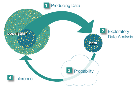
The Big Picture
The population is the entire group that is the target of our interest. Producing data involves choosing a sample of the population and collecting data from it. Usually we choose a sample because the population is too large to examine as a whole. Exploratory Data Analysis consists of summarizing the collected data. Probability tells us how the sample we're using may differ from the population as a whole. Probability is the "machinery" that allows us to draw conslusions about the population based on the data collected about the sample. Finally, we can use what we've discovered about our sample to draw conslusions about the population based on the data collected about the sample. Finally, we can use what we've discovered about our sample to draw conslusions about our population. We call this final step in the process inference.
Unit 1 - Exploratory Data Analysis
Introduction
Data are pieces of information about individuals organized into variables. By an individual, we mean a particular person or object. By a variable, we mean a particular characteristic of the individual.
A dataset is a set of data identified with particular circumstances. Datasets are typically displayed in tables, in which rows represent individuals and columns represent variables.
Quantitative variables take numerical values, and represent some kind of measurement. Categorical variables take category or label values, and place an individual into one of several groups.
Exploratory Data Analysis (EDA) is how we make sense of the data by converting them from their raw form to a more informative one. EDA consists of:
- Organizing and summarizing the raw data,
- Discovering important features and patterns in the data and any striking deviations from those patterns, and then,
- Interpreting our findings in the context of the problem
Distributions are concerned with one variable at time. Replationships are concerned with two variables at a time.
Module 1 - Examining Distributions
By distribution of a variable, we mean:
- What values the variable takes, and
- How often the variable takes those values.
One Categorical Variable
The distribution of a categorical variable is summarized using:
- Graphical display: pie chart or bar chart, supplemented by
- Numerical summaries: category counts and percentages.
The pie chart emphasizes how the different categories relate to the whole, and the bar chart ephasizes how the different categories compare with each other.
One Quantitative Variable
To display data from one quantitative variable graphically, we can use either the histogram or the stemplot.
Breaking a range of values into intervals can be useful for graphing. The square brakcet means "including" and the parenthesis means "not including". For example, [50,60) is the interval from 50 to 60, including 50 and not including 60.
- Graphs
- Histogram
Once the distribution has been displayed graphically, we can describe the overall pattern of the distibution and mention any striking deviations from that pattern. More specifically, we should consider the following features of the distribution:
- Overall pattern:
- Shape
- Center
- Spread
- Deviations from the pattern:
- Outliers
- Shape
When describing the shape of a distribution, we should consider:
- Symmetry/skewness of the distribution
- Peakedness (modality) - the number of peaks (modes) the distribution has.
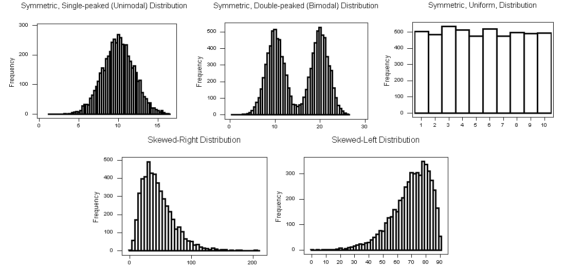
Clockwise from left: symmetric, single-peaked (unimodal); suymmetric, double-peaked (bimodal); symmetric, uniform; skewed-left, skewed-right.
Note that if a distribution has more than two modes, we say that the distribution is multimodal.
- Center
The center of the distribution is its midpoint - the value that divides the distribution so that approximately half the observations take smaller values, and approximately half the observations take larger values.
- Spread
The spread (also called variability) of the distribution can be described by the approximate range covered by the data. From looking at the histogram, we can approximate the smallest observation (min), and the largest observation (max), and thus approximate the range.
- Outliers
Outliers are observations that fall outside the overall pattern.
It is always important to interpret what the features of the distribution (as they appear in the histogram) mean in teh context of the data.
- Overall pattern:
- Stemplot
The stemplot (also called stem and leaf plot) is another graphical display of the distribution of quantitative data. Separate each data point into a stem and leaf, as follows:
- The leaf is the right-most digit.
- The stem is everything except the right-most digit
- So, if the data point is 34, then 3 is the stem and 4 is the leaf
- If the data point is 3.41, the 3.4 is the stem and 1 is the leaf
For example, with the data: 34 34 26 37 42 41 35 31 41 33 30 74 33 49 38 61 21 41 26 80 43 29 33 35 45 49 39 34 26 25 35 33
- Separate each observation into a stem and a leaf.
- Write the stems in a vertical column with the smallest at the top, and draw a vertical line at the right of this column.
- Go through the data points, and write each leaf in the row to the right of its stem.
- Rearrange the leaves in an increasing order
2|156669 3|013333444555789 4|11123599 5| 6|1 7|4 8|0
When some of the stems hold a large number of leaves, we can split each stem into two: one holding the leaves 0-4, and the other holding the leaves 5-9.
2|1 2|56669 3|0133334444 3|555789 4|11123 4|599 5| 5| 6|1 7|4 6| 8|0
Note that when rotated 90 degrees counterclockwise, the stemplot visually resembles a histogram. The stemplot has additional unique features: it preserves the original data and sorts the data.
- Histogram
- Numerical Measures
The overall pattern of the distribution of a quantitative variable is described by its shape, center, and spread. By inspecting the histogram, we can describe the shape of the distribution, but as we saw, we can only get a rough estimate for the center and spread. A description of the distribution of a quantitative variable must include, in addition to the graphical display, a more precise numerical description of the center and spread of the distribution.
- Measures of Center
The three main numerical measure for the center of a distribution are the mode, the mean, and the median. The mode is the most commonly occuring value in a distribution; it's the "peak" of the distribution. The mean is the average of a set of observations. We denote this as x-bar. The median M is the midpoint of the distribution. If n is odd, the median is the center observation in the ordered list. If n is even, the median is the mean of the two center observations in the ordered list.
Note that the mean is very sensitive to outliers (because it factors in their magnitude), while the median is resistant to outliers. So for symmetric distributions with no outliers, x-bar is approximately equal to M. For skewed right distributions and/or datasets with high outliers, x-bar > M. For skewed left distributions and/or datasets with low outliers, x-bar < M.
- Measures of Spread
The three most commonly used measures of spread are range, inter-quartile range (IQR), and standard deviation. The range is exactly the distance between the smallest data point (min) and the largest one (max).
- Inter-Quartile Range (IQR)
While the range quantifies the variability by looking at the range covered by all the data, the IQR measures the variability of a distribution by giving us the range covered by the middle 50% of the data.
IQR = Q3 - Q1, the difference between the third and first quartiles. The first quartile (Q1) is the value such that one quarter (25%) of the data points fall below it, or the median of the bottom half of the data. The third quartile is the value such that three quarters (75%) of the data points fall below it, or the median of the top half of the data.
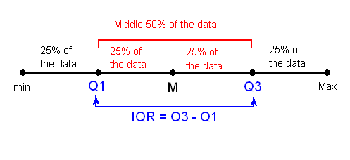
Note that when n is odd, the median is not included in either the bottom or top half of the data; When n is even, the data are naturally divided into two halves.
The IQR is used as the basis for a rule of thumb for identifying outliers. An observation is considered a suspected outlier if it is:
- below Q1 - 1.5(IQR) or
- above Q3 + 1.5(IQR)
Depending on the cause of the outlier, one may want to include or remove the data point. For example, outliers produced by the same process that are expected to eventually occur again should be kept. But outliers produced under different conditions or by mistake should be removed or corrected.
- Inter-Quartile Range (IQR)
- Boxplot
The five-number summary of a distribution consists of the median (M), the two quartiles (Q1, Q3), and the extremes (min, Max). The boxplot depicts the five number summary (blue), the range and IQR (red), and outliers (green).
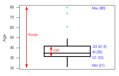
Boxplots are most useful when presented side-by-side for comparing and contrasting distributions from two or more groups.
- Standard Deviation
Another measure of spread, the standard deviation (SD), quantities the spread of a distribution in a completely different way. The idea behind the standard deviation is to quantify the spread of a distribution by measuring how far the observations are from their mean, x-bar. The standard deviation gives the average (or typical distance) between a data point and the mean.
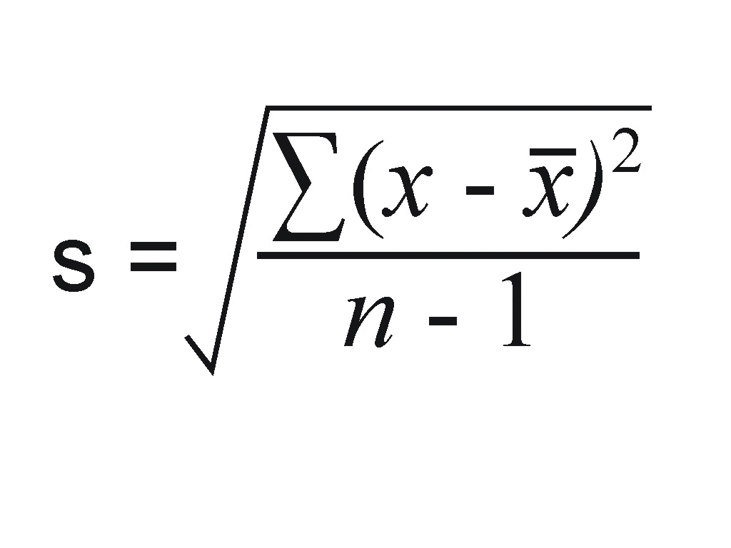
Note that the average of the square deviations (the part weithin the square root) is called the variance of the data. So the SD of the data is the square root of the variance.
So while the IQR should be paired as a measure of spread with the median as a measure of center, the SD should be paired as a measure of spread with the mean as a measure of center.
Like the mean, the SD is strongly influenced by outliers in the data. Use x-bar (the mean) and the standard deviation as measures of center and spread only for reasonably symmetric distributions with no outliers. Use the five-number summary (which gives the median, IQR, and range) for all other cases.
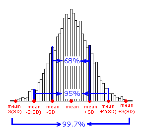
For symmetric mound-shaped distributions, the Standard Deviation Rule tells us what percentage of the observations falls within 1, 2, and 3 standard deviations of the mean, and thus provides another way to interpret the standard deviation's value for distributions of this type. The rule:
- Approximately 58% of the observations fall within 1 standard deviation of the mean
- Approximately 95% of the observations fall within 2 standard deviations of the mean
- Approximately 99.7% (or virtually all) of the observations fall within 3 standard deviations of the mean.
- Measures of Center